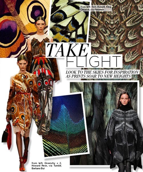
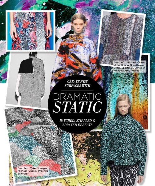
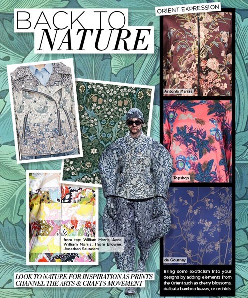
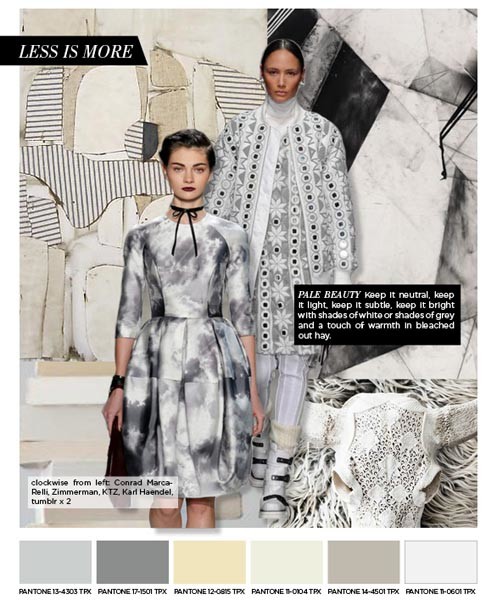
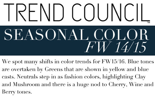
Color Preview for All Markets, F/W 2015-16 Trends
Courtesy of Design Options Inc
We are thrilled that Design Options loves WeConnectFashion. We love their color trends and that the’ve given us permission to share this report, a preview of Fall / Winter 2015-16 color. One color theme for: men’s, women’s, kids, and home interiors. Enjoy the sneak peek.
WOMEN’S COLOR THEME
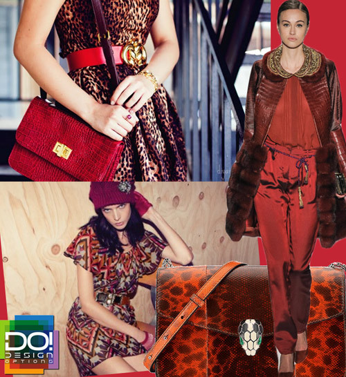
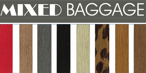
Mixed Baggage.
A plethora of comprehensive textures and structural reconfigurations. Chestnut brown and candy apple red shades of heterogeneous and transfused accoutrements defy conventional perspectives with artistic originality. Slate grey and onyx saturations of customary parcels and diversified decor fuse chiffon leopard prints with geometric patterns in an effortless manner. Multifarious and ingenious.
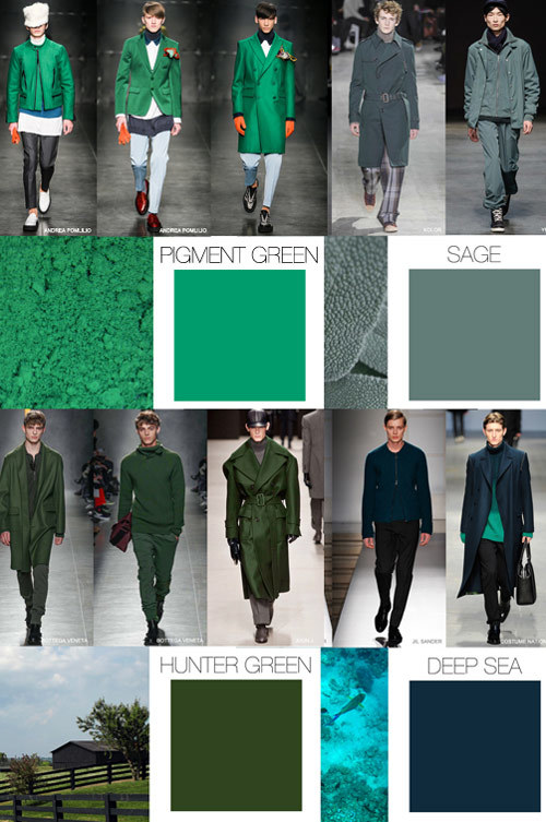
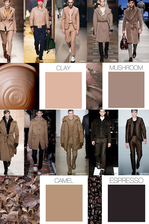
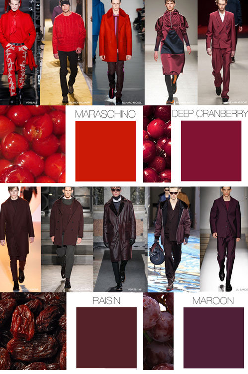
MEN’S COLOR THEME
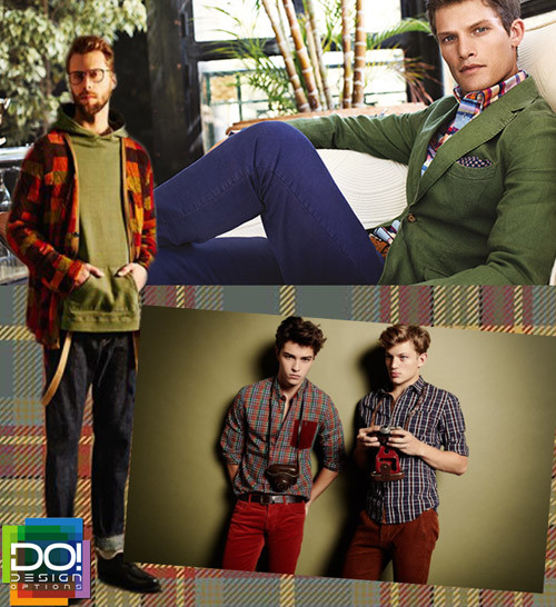
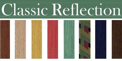
Classic Reflection.
Contemplative representations of innovative grandeur. Raw sienna and desert sand colorations are reminiscent of vintage essentials. Coral and dark sepia shades of speculative panache and savoir-faire indicate impeccable sophistication. Mustard and midnight blue fuse symbolically with sea green. A portrait of unrelenting antiquity.
CHILDREN’S COLOR THEME
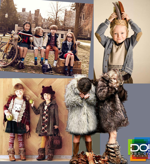
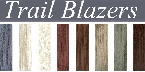
Trail Blazers.
An animated and rustic journey with a seeking spirit foradventure. Flecks of silver are reminiscent of a late-autumn thunderous afternoon and accentuate superfluous fleece fabrications. Sun-burnt sienna shades and cinnamon brown undertones resonate with joyous clarity. Ivory and chestnut saturations create a symbiotic unison upon a canvas of rugged appeal. Blazing a path for future generations.