Wednesday 3 June 2015

Revamped Florals, Women's Prints S/S 2016

Revamped Florals, Women's Prints S/S 2016

Courtesy of Trendstop

Offbeat Oriental Blooms

trendstop-ss16_w_florals
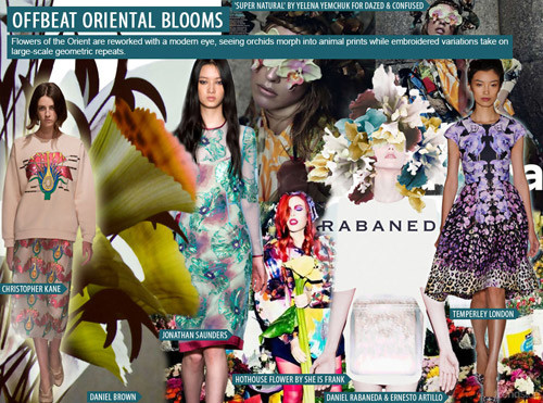
image courtesy Trendstop: Christopher Kane, Jonathan Saunders both Spring/Summer 2014, Daniel Rabaneda & Ernesto Artillo, Temperley London Spring/Summer 2014.

APPAREL

trendstop-ss16_w_florals1
Flowers of the Orient are reworked with a modern eye, infusing Spring/Summer 2016 apparel with an organic edge of sophistication. Botanical blossoms stand out in large sizes at Christopher Kane, as sheer layering makes for double the fun at Jonathan Saunders. At Temperley London, delicate florals materialize in multiple scales and come fused with leopard print paneling.

ACCESSORIES

trendstop-ss16_w_florals2
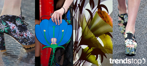
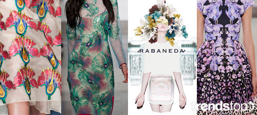
image courtesy Trendstop: Mary Katrantzou, Christopher Kane, both Spring/Summer 2014, Daniel Brown, Erdem Spring/Summer 2014.
Suitable for all Market types, Offbeat Oriental Blooms accessories complement the apparel styles with their mood of refined exoticism. Digital print blooms stand out on dark bases on lace-up Mary Katrantzou footwear, while Christopher Kane goes biology chic with flower anatomy-shaped bags. Erdems pastel blue and green print makes a statement with plain black straps on platforms.
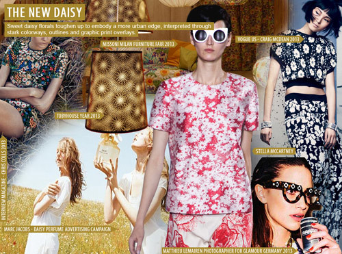
The New Daisy

trendstop-ss16_w_florals3

APPAREL

trendstop-ss16_w_florals4
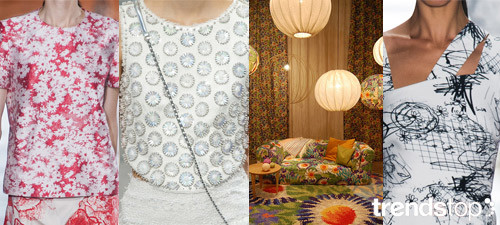
image courtesy Trendstop: Stella McCartney, Chanel, both Spring/Summer 2014, Missoni Milan Furniture Fair 2013, Cushnie et Ochs Spring/Summer 2014.
Sweet daisy florals toughen up to embody a more urban edge, as interpreted through stark colorways, outlines and graphic print overlays. Clean white blooms flourish on sporty Stella McCartney tees, as Chanel goes 3D with beaded embellishment on white tops. Cushnie et Ochs taps into a more artistic mood with hand-drawn doodles on an asymmetric shape.

ACCESSORIES

trendstop-ss16_w_florals5
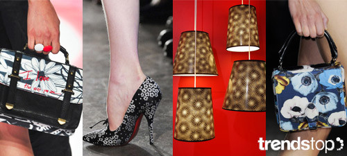
image courtesy Trendstop: Marni, Prada, both Spring/Summer 2014, Philip Treacy, Simone Rocha Spring/Summer 2014.

Monday 19 January 2015

Color Preview for All Markets, F/W 2015-16 Trends


Color Preview for All Markets, F/W 2015-16 Trends

Courtesy of Design Options Inc


We are thrilled that Design Options loves WeConnectFashion. We love their color trends and that the’ve given us permission to share this report, a preview of Fall / Winter 2015-16 color. One color theme for: men’s, women’s, kids, and home interiors. Enjoy the sneak peek.

WOMEN’S COLOR THEME

designoptions-fw16_w designoptions-fw16_w_color

Mixed Baggage.

A plethora of comprehensive textures and structural reconfigurations. Chestnut brown and candy apple red shades of heterogeneous and transfused accoutrements defy conventional perspectives with artistic originality. Slate grey and onyx saturations of customary parcels and diversified decor fuse chiffon leopard prints with geometric patterns in an effortless manner. Multifarious and ingenious.

MEN’S COLOR THEME

designoptions-fw16_m designoptions-fw16_m_color

Classic Reflection.

Contemplative representations of innovative grandeur. Raw sienna and desert sand colorations are reminiscent of vintage essentials. Coral and dark sepia shades of speculative panache and savoir-faire indicate impeccable sophistication. Mustard and midnight blue fuse symbolically with sea green. A portrait of unrelenting antiquity.

CHILDREN’S COLOR THEME

designoptions-fw16_kids designoptions-fw16_kids_color

Trail Blazers.

An animated and rustic journey with a seeking spirit foradventure. Flecks of silver are reminiscent of a late-autumn thunderous afternoon and accentuate superfluous fleece fabrications. Sun-burnt sienna shades and cinnamon brown undertones resonate with joyous clarity. Ivory and chestnut saturations create a symbiotic unison upon a canvas of rugged appeal. Blazing a path for future generations.

Monday 12 January 2015

Women's Print And Color Guide F/W 2015-16

Women's Print And Color Guide F/W 2015-16

Courtesy of Pattern People

An inspirational report from one of our favorite surface design teams. View a teaser of print and color direction from Pattern People’s newly released Winter 2015 trend guide for the women’s market. On view, five mood boards to get you inspired and started on the upcoming season.

Seasonal Surface Direction

TAKE FLIGHT

From butterflies to birds, use the sky for inspiration as animal prints channel winged creatures this season.
patternpeople-fw15_1


DRAMATIC STATIC

Patched, stippled and sprayed effects turn textures into a work of art.
patternpeople-fw15_2


BACK TO NATURE

Stylized botanical blooms with an Arts & Crafts feel creep their way across the runways bringing a sense of enchantment with them.
patternpeople-fw15_3


Color Direction

LESS IS MORE

Bleached out shades of bone and white brighten up the winter palette.
patternpeople-fw15_4


FOREST BLOOM

Rich shades of hot pink and maroon get paired with earthy, calming greens for a vibrant jolt of energy.
patternpeople-fw15_5

Women's Color Trends, F/W 2015-16 Forecast

Women's Color Trends, F/W 2015-16 Forecast

Courtesy of Fashion Snoops


The Top Ten Colors
Five key color families have been identified: Spices, Ceramics, Glacier Spa, Thrones and Lab Brights. Spice signals a return to warmth, influenced by ethnic accent hues. A new retro range of Ceramics addresses enticing saturated mid tones, while Glacier Spa focuses on the continuation of soft pastels with a wider range. Thrones evolve from regal and jewel tones as one of the most popular families. Lab Brights presents an evolution of proven and commercial fashion colors along with select new accents.

FOREST GREEN

Forest is a favored green which stands out especially on wool outerwear. Top Color, Womens Market, F/W 2015-16, FOREST GREEN


BURGUNDY

A brown-cast alternative to maroon, burgundy becomes one of the most popular reds of the season.
Top Color, Womens Market, F/W 2015-16, BURGUNDY
Navy becomes an increasingly popular choice as a base color set to various textures.
Top Color, Womens Market, F/W 2015-16, NAVY


SCARLET

As far as red goes, scarlet powers forward as a popular option in vibrant shades.
Top Color, Womens Market, F/W 2015-16, SCARLET


MOSS

Milan designers feature a portfolio of greens for the season, with mid tones of moss making an impression.
Top Color, Womens Market, F/W 2015-16, MOSS


SKY

Sky is one of the most popular soft pastels this season set to both mid and bright tones.
Top Color, Womens Market, F/W 2015-16, SKY


WINTER WHITE

Winter white makes a strong seasonal statement, leveraged on a variety of head-to-toe looks. Plush textures and knitwear are of note.
Top Color, Womens Market, F/W 2015-16, WINTER WHITE


PALE PINK

Pale pink is the most saturated soft pink tone this season. Ralph Lauren presents noteworthy shades.
Top Color, Womens Market, F/W 2015-16, PALE PINK


MUSHROOM

Mushroom is introduced as a new neutral, set to muddy grey tones.
Top Color, Womens Market, F/W 2015-16, MUSHROOM


SALMON PINK

Salmon pink is a new color this season which makes a noteworthy retro statement at Carven, set to dark tones.
Top Color, Womens Market, F/W 2015-16, SALMON PINK

Mens and Womens Print Direction F/W 2015-16


Mens and Womens Print Direction F/W 2015-16

Courtesy of Fashion Snoops


Take a first glance into the F/W 15/16 top prints and patterns for women and men as forecasted by the editors at Fashion Snoops. The beauty of nature continues to be a main source of inspiration seen in Faux Texture for women and Arctic Chill for men. Classic Plaid prints are updated this season with clashing color combos for women, while fashion forward graphics like City Tour for men draw inspiration from maps to iconic architecture.

WOMENS DIRECTIONAL PRINTS & PATTERNS

FAUX TEXTURE

Top Prints and Patterns, Women's Market, F/W 2015-16, FAUX TEXTURE
The faux textures divide into two main groups- as we try to fake the textures of mother nature and of other materials and textures such as cable knit. Nature inspires, from growing bacteria to geology and natural crop circles, we see great depth here, as well as bark, fur, wood being faked in a digital design. It is one of the broadest and yet largest graphic expressions.

OPTICAL ILLUSIONS

Top Prints and Patterns, Women's Market, F/W 2015-16, OPTICAL ILLUSIONS
Optical illusion prints are once again catching our eye, literally. Worn head to toe the prints are typically tamer and monochrome, as opposed to the a-line mini dresses which are bold in color and design. Size altering chevrons add newness to this trend. By the time they reached Paris they grew in strength and diversity, ranging between “squint your eyes to be hyptoinized” designs to oversized swirls, flowing in random directions. Excitement comes when these illusions are on citrus limes and oranges and are sliced geometrics.

PLAIDS

Top Prints and Patterns, Women's Market, F/W 2015-16, PLAIDS
There’s always a plaid on offer, especially as the colder weather starts to creep back in. For Fall 14 the color palette includes various orange tones and a strong cobalt blue, muted, menswear monochromes and of course a huge influx of red tartan. Newness comes when the plaids are pieced together with clashing color combos, or lime green options on blazers, vests and oversized outerwear.

MENS PRINTS AND PATTERNS

ARCTIC CHILL

Top Prints and Patterns, Men's Market, F/W 2015-16, ARCTIC CHILL
Top Prints and Patterns, Men's Market, F/W 2015-16, ARCTIC CHILL inspiration
The elements inspire Arctic Chill, as we see photo real imagery alongside abstract digital creations, which add great texture and depth to outerwear and tailored pants. Blisteringly cold waters, cracking ice and snowy skies inspire the imagery as the color palette is equally frosty.

CITY TOUR

Top Prints and Patterns, Men's Market, F/W 2015-16, CITY TOUR
Top Prints and Patterns, Men's Market, F/W 2015-16, CITY TOUR inspiration
From city maps to sketches and screens of iconic architecture, the designers in London want to take us on a tour of their favorite cities, with London of course being of most importance. The fragility of the lines at Orlebar Brown appear somewhat playful whereas Burberry Prorsum’s map appears to be an essential for the lost tourist.

COLLISION

Top Prints and Patterns, Men's Market, F/W 2015-16, COLLISION
Top Prints and Patterns, Men's Market, F/W 2015-16, COLLISION inspiration
The collaged graphics have evolved for Fall, as images collide together in various formations. Delicate designs are created with illustrations sitting on top of digital imagery manipulated with motion blurs or pixilation, which sit as a central screen. Larger all over designs are also relevant, which show the designers freedom, with simple geometrics or strips of fabric, which are pieced together sporadically and freely on overcoats and woven sweatshirts.

Color Preview for HOME INTERIORS, F/W 2015-16

Color Preview for All Markets, F/W 2015-16 Trends

Courtesy of Design Options Inc

HOME INTERIORS COLOR THEME
designoptions-fw16_home designoptions-fw16_home_color

Simply Elegant.

Unpretentious and dignified with modernistic style. Icy silver flecks of unreservedly ornamental and precisely polished illuminate a backdrop of brilliant brocade. Alabaster and smoky grey shades uncover a landscape of limitless horizons. Subtle nuances are revealed on a backdrop of eloquently texturized patterns. Artistic fusions that satisfy the intellect.

Menswear Color Evolution F/W 2015-16

Menswear Color Evolution F/W 2015-16

Courtesy of Trend Council

According to Trend Council, many shifts are occuring in color trends for the Fall/Winter 2015-16 menswear market. Here’s the evolution from Fall 2014 to Fall 2015: Blue tones are overtaken by Greens that are shown in yellow and blue casts. Neutrals step in as fashion colors, highlighting Clay and Mushroom.

trendcouncil-fw15_m_top_color1

Green Tones

trendcouncil-fw15_m_top_color2

Fahion Neutrals

trendcouncil-fw15_m_top_color3

Dynamo Red Tones

trendcouncil-fw15_m_top_color4

Womens and Mens Original Artwork F/W 2015-16 Inspiration

Womens and Mens Original Artwork F/W 2015-16 Inspiration

Courtesy of Fashion Snoops

Get a first look at the F/W 15/16 original artwork as forecasted by the editors at Fashion Snoops. Cautionary Tale florals overlap with and strengthen The Royals theme for women, which is given a feminine touch with hand drawn styles. These are additionally seen throughout the Pen & Ink trend for men, where doodles, sketched faces, and traditional screen-printing methods come together for unique illustrated options. Geometrics and graphics are dominant in the Rubiks Cube theme for women and Bauhaus for men, adding a playful, nostalgic, and experimental trend into the mix.

WOMEN’S PRINT DIRECTION

THE ROYALS

Original Art Surface Inspiration, Women's, F/W 2015-16, the royals
Original Art Surface Inspiration, Women's, F/W 2015-16, the royals detail
The hand drawn style to our graphics adds a great feminine touch to this otherwise dark and medieval trend, which is strengthened by the addition of Cautionary Tale florals and Damask wallpaper prints. Two of our designs are pliable to both pattern and screens, and we also offer a repeat conversational of illustrated locks and keys as we protect all that is valuable.

CAUTIONARY TALE

Original Art Surface Inspiration, Women's, F/W 2015-16, CAUTIONARY TALE
Original Art Surface Inspiration, Women's, F/W 2015-16, CAUTIONARY TALE detail
William Morris was our main source of inspiration when it came to womens Cautionary Tale graphics. Weve created three all over designs inspired by his great wallpapers and tapestries. The colors vary between warm reds and bold blues, as we have included hand drawn and also digitally structured florals. They are all organized so to be used as a repeat, although printing them in panels/pieced sections is also a great option.

RUBIKS CUBE

Original Art Surface Inspiration, Women's, F/W 2015-16, RUBIKS CUBE
Original Art Surface Inspiration, Women's, F/W 2015-16, RUBIKS CUBE detail
Rubik’s Cube is where the fun comes into play, as we see 80s and 90s inspired geometrics: seemingly random in shape, we offer two very different graphics. One is full of primary colors and vivid, as we reinvent the check, and the second is a more subtle monochrome alternative with fun shapes repeated in a mature colorway.

MEN’S PRINT DIRECTION

BAUHAUS BLOCK

Original Art Surface Inspiration, men's, F/W 2015-16, BAUHAUS BLOCK
Original Art Surface Inspiration, men's, F/W 2015-16, BAUHAUS BLOCK detail
Bauhaus, and in particular Kadinsky definitely inspire here, with a more simplistic version of geometric lines and color blocks with a mathematical element to them, as the geometrics are symmetrical and balanced. The simple design allows for experimentation with texture, material and color. We kept one of our designs two-dimensional, being super simple and ready to be placed on a sweatshirt, and the other design has a colored pencil textured element in a primary colorway which takes us right back to Math class, with a sense of nostalgia.

PEN & INK

Original Art Surface Inspiration, men's, F/W 2015-16, BAUHAUS BLOCK
Original Art Surface Inspiration, men's, F/W 2015-16, BAUHAUS BLOCK detail
Doodles, sketched faces and traditional screen printing methods come together within Pen and Ink. All four of our designs are great screen options, which can be easily recolored. We offer you two simple lined face illustrations, both perfect for a simple screen, alongside one more sketchy, free design and lastly an edited digital painting with motion blur and paint splatters to add texture to the background.

COLLISION

Original Art Surface Inspiration, men's, F/W 2015-16, COLLISION
Original Art Surface Inspiration, men's, F/W 2015-16, COLLISION detail